Genre: RPG Developer: Wolf Team Publisher: Wolf Team Players: 1 Released: 1992
The release of the Sega CD was supposed to unleash a new era of gaming for Genesis owners. Tons of storage, CD-quality audio and all the animated and video cut scenes one could ever want were major selling points. I was already a big fan of the TurboGrafx-16 CD-ROM and had fallen in love with Exile, Ys, and Dragon’s Curse. After seeing images of all the upcoming Sega CD RPGs in magazines like Electronic Gaming Monthly, a Sega CD purchase seemed to be a lock for me.
As time wore on, however, I became increasingly frustrated. So many of those great-looking RPGs never left Japan, and we were instead fed a steady diet of full-motion video titles and Genesis ports with CD audio. Still, I never forgot games like Aisle Lord, Death Bringer, Arcus I,II, II; and Shadowrun. Years later, I was finally able to experience them, and some, like the Arcus games, were everything I had imagined. Others, such as Aisle Lord, were bittersweet, like a banana that’s just started to go bad. It still has some good parts, but you were really looking forward to enjoying the whole thing.
Aisle Lord, crafted by the amazing Wolf Team, initially sparked intrigue with its pre-title animated sequence, reminiscent of a forgotten OVA and just the thing I wanted from my Sega CD games. The expressive scenes, brimming with character introductions and voice cast credits, coupled with Haruhiko Mikimoto’s (Gunbuster, Macross) distinctive artwork, set a promising tone. However, as the game unfolded, it became evident that Aisle Lord’s innovative approach was overshadowed by fundamental design flaws.
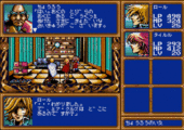
One commendable aspect was the point-and-click interface reminiscent of Wolf Team’s computer roots, but the execution faltered with a cursor system that felt clunky and counterintuitive. The absence of a context-sensitive action button led to frustrating interactions, undermining the interface’s effectiveness. Why did I have to point and click when in town but get to use the D-pad in dungeons? Why not simply pick one mechanic and stick with it? It wouldn’t have been so bad if the point-and-click interface was smooth, but using the controller made it slow and frustrating. I couldn’t help but think of Shining in the Darkness, which went out of its way to make navigation easy and intuitive. I didn’t expect that level of care, but Aisle Lord could at least have met me halfway.
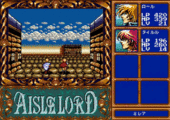
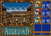
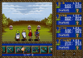
Additionally, environments had little variety to their looks, and the lack of navigational aids when wandering the environments turned exploration into a laborious and disorienting experience. That’s right. There was no compass or navigational aids of any kind except for a weak map spell later on that doesn’t reveal enough to be relevant. Normally, old school gamers wouldn’t fret and would just reach for a pencil and some graph paper, but the absence of distinguishing features within dungeons rendered map-making futile, exacerbating the sense of aimless wandering. It was like Wolf Team had originally designed Aisle Lord with the perspective of a first-person dungeon crawler, but then added a tiny figure in the middle of the screen near the end of development. The result was that each area looked huge and empty, and they were a major pain to navigate.
Even the combat encounters, while offering a grid-based system, couldn’t redeem the gameplay. The pseudo-real-time battles had some tension to them, but their strategic depth was hindered by cumbersome mechanics and lackluster execution. Enemies all moved around the grid simultaneously, and once you chose your action, you sat back and watched everyone go. There were glimpses of potential, particularly in how battles handled enemies positioned farther away or flying, but they couldn’t make combat exciting. Again, I was reminded of another 16-bit RPG, Might & Magic II on Genesis, which had battles that were just as dull and tedious.
Playing Aisle Lord, one got the impression that it wanted to be several games at once, but none of it every really worked, and comparisons to contemporaneous Sega CD titles make Aisle Lord’s failings all the more evident. While Wolf Team attempted to innovate within the dungeon-crawling RPG genre, the game ultimately fell short of its more notable predecessors. Even earlier, and admittedly, weaker titles, like Wakusei Woodstock: Funky Horror Band, with its rudimentary visuals, offered more comprehensive navigational aids and player guidance. The lack of such basic features in Aisle Lord was a glaring oversight that diminished the overall experience.
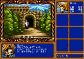
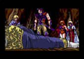
I know that sounds overly negative, but the experience wasn’t all bad. The visuals were crisp and colorful, and there was a variety of environments to explore. The story, from what I could gather of it, seemed deep enough, and the characters had their charm. Furthermore, there was plenty of voice acting and lots of animated cut scenes, a big attraction back in 1992. The problem was that while Aisle Lord did a decent job of creating a believable game world, it just didn’t make it that much fun to be in.
In conclusion, while Aisle Lord showed moments of creativity and ambition, its execution ultimately left much to be desired. The game’s innovative approach to interface design and combat mechanics was marred by fundamental flaws in navigation and gameplay depth. In a landscape populated by superior titles, Aisle Lord struggled to distinguish itself, failing to capitalize on its potential and leaving players a bit disillusioned. It was a rare misstep by the usually solid Wolf Team.




Recent Comments