Genre: Board Game Developer: Sega Europe Publisher: Sega Ent. Players: 1-2 Released: 1991
By 1991, the Sega Genesis had been out for some years, and Sonic The Hedgehog was starting to blow up. In the US, the Genesis was the first Sega console that most people had heard of, while other parts of the world had been enjoying the Master System in previous years, when the NES had ruled in the US. As the Genesis gained popularity around the globe, the Master System managed to keep surviving in certain countries that it was already established! So this is the context for Sega Chess, released exclusively in Europe in 1991, plus also released in Brazil at some point, as the Master System had strongholds in these places, which overlapped into the Genesis’ life-span.
Chess programs from the early ’90s are not expected to be very advanced, so it’s a given that the artificial intelligence is limited here, like practically any title from that time. This means that Sega Chess should not be hoped to provide a hardcore challenge, or amazingly smart gameplay. At best, it can be hoped to provide moderately challenging, competent gameplay, which it does, for the most part. These early chess programs can be appealing for their imperfect AI, which can make them resemble playing against humans.
Also, it’s worth noting that this is apparently the only chess title ever released for the Master System. So, for countries that were focused on the console, this would have been their only choice of a chess video game! We can imagine chess fans of the early ’90s playing this on their Master Systems, across Europe and Brazil.
The same year of Sega Chess (1991), the Game Gear received its version of The Chessmaster and two years later, Sega CD would receive Star Wars Chess; however, the Genesis would never get an official chess title. Only Russia got the unofficial release Chess in 1998 (which can now be purchased anywhere, as a nice repro). This means that Sega Chess is actually the only official chess cartridge that can be played on Genesis (using the Power Base Converter).
Since its year of release practically guarantees that the chess software is limited. The appeal of Sega Chess would have to be its presentation! In other words, the AI can’t possibly be very advanced, so the selling-points should be the graphics, audio, and overall experience! Unfortunately, Sega Chess is not dazzling, so we start wondering what its relevance is!
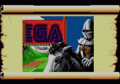
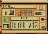
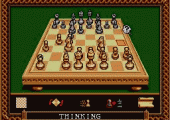
The sparkling title screen looks quite nice, along with the intro sequence, showing a medieval knight hoisting a blood-red flag for Sega! But then the graphics fall flat. The spinach-green background is permanent, and the menus are built of visual cues, instead of words. Obviously these symbols are meant to be intuitive, but in practice, they’re unintuitive, and the menus just look like a mess! For example, why should the options screen of a chess game contain a sexy lipstick-red mouth, or a thumbs-up sign? How about that tiny little Master System controller, or that manikin head?! The menus might work, but they’re a jumble of ugly images!
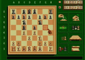
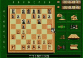
I also dislike that there are symbols present on every screen, and there’s no way to only show the board, which would seem the most obvious view that everyone would want. Practically every other chess video game has a view of only the board, so it’s not like chess itself requires all these symbols, all the time! It’s especially ridiculous that there’s a permanent icon to upgrade a pawn, which might only happen once or twice per match! It doesn’t need an icon to be displayed every moment of the game, and it seems like it’s there just because the developers needed one more option, to fill in that square.
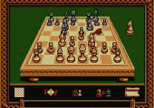
Similarly, the permanent icon to swap sides – that is, to suddenly play as the opposing side – will probably never get chosen at all, except by accident, so such icons just seem like unnecessary clutter. The 3D mode has that icon replaced with one to just rotate the board, while remaining the same color, just to look at the 3D board from the enemies’ perspective. It looks cool but will almost never be used, so its fixed icon is likewise unnecessary.
Sega Chess also has to be directly compared with The Chessmaster on Game Gear, which has two main buttons, like the Master System. But it manages all its moves and options without symbols, because the options are cleverly built into those two buttons, plus a few menu screens (of text). It’s a completely better control system, and it keeps the screen clear, showing only the chessboard! Options like rushing the CPU, and take-back/replay can all be done with only those two buttons, while the same options in Sega Chess require the cursor to float across the screen tediously, and select icons. It’s even more awkward than it sounds, because the cursor doesn’t land on top of the choices, rather it lands on the bottom right corner of each box, so it’s hard to see which one is being chosen! So the controls work, but everything is overly complicated and burdensome.
Infinite Thinking Mode is the strongest difficulty level, and I wanted to see the game’s best performance! The first few moves only took a few minutes of thinking, less than five minutes per move, so it was nice to see that the early moves can happen without much processing. Then when it was thinking over its next move, I left the game alone. I came back three hours later, and it was still thinking! I visited the options screen, and then the CPU moved immediately, so it turns out that visiting the options actually makes it get rushed (in addition to the specific icon for rushing it). And I dislike this quirk, that visiting options triggers the AI to get rushed. It really doesn’t make sense as an automatic function like this! Those three hours’ thinking only resulted in the CPU moving a pawn forward from its starting position, a basic and rather pointless move. So this is not a game that can be realistically played against its top difficulty, because it wants so many hours to think! Unless we plan on having the same match stretch on for a few days or weeks, it’s impossible not to rush it. Therefore, its absolute best performance might never really be seen by anyone!
Given the year and the 8-bit hardware, the general limitations of its AI can’t be held against it, except that its contemporary, Game Gear Chessmaster, makes its top-difficulty moves within about 50 minutes (and it’s usually more like 20 or 30 minutes), so it’s still playable! For all the hours of thinking that Sega Chess wants (on top difficulty), it just seems ridiculous, and I’m not convinced that the hours are really cranking out better gameplay. The fact that it can want hours for even the simplest moves, like moving a pawn forward, gives me the impression that the processing is slow and inefficient!
I became curious how many hours it really wants, so I started to leave the game running as much as possible. I let it keep thinking about a fairly simple situation of its pawn being threatened, with some other pieces around it. A person might spend a few minutes thinking about it. Sega Chess spent over five hours thinking, without deciding what to do! I let it keep thinking. Soon it was eight hours! Then it was 14 hours… 24 hours… 27 hours!
So how many hours does this title really want? The answer is: So many hours, that it’s impossible to quantify! Top difficulty is unplayable, unless people keep rushing it, which presumably drops its performance, and means it’s not really top difficulty. It’s disappointing that the real top difficulty means letting it think for days at a time, so it’s just not playable, in the normal sense!
It was also disappointing to find that the timer doesn’t keep track of hours into the double-digits; for example, if 11 hours pass by, it will only show as one hour. This might not seem problematic, except that the CPU can easily spend more than 10 hours per move, so there can be full cycles of numbers that don’t get recorded properly. And since the game wants so many hours to think, it should at least count its hours accurately!
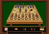
The chessboard’s graphics are decent, especially 3D mode, which features the pieces impressively drawn bigger or smaller, as they get closer or further away! Personally, though, I always find such 3D modes as hard to see everything clearly enough, so I stick to 2D mode, which is basic, but very clear. Unfortunately, there’s always that spinach-green backdrop, and a mess of symbols on the bottom or side. The graphics never come together as forming a nice complete picture!
The controls are functional, with the cursor floating across the board, from one square to another. The Master System’s two buttons mean that one is used to select things, and the other to let go of things, basically. What doesn’t work well is choosing among the picture symbols, where the cursor makes larger jumps among the odd symbols. It’s always an awkward process! The symbol options are also slightly lacking for 3D mode, so moves can’t be taken-back/replayed, unless it’s in 2D. Which is fine, but which seems a pointless limitation: 3D mode seems to lack such options just because there was less space on-screen to put those icons! Similarly, 3D mode lacks a hint option, which is not a loss, since the 2D hints are not reliable as good advice anyway. In 3D mode, it also seems difficult to rush the CPU to move, for whatever reason.
The audio is mainly used to simulate a gentleman’s running commentary, and while this idea has good potential, it’s actually implemented poorly. His voice makes an announcement for each move, but it’s ruined by his odd commands: “White, move! Black, move! White, move!” Instead of sounding impressive, it sounds robotic and unrealistic, since he doesn’t need to keep ordering us to “move” for each turn! There’s also a chime sound when the player does move, which can sound annoying. The audio is altogether unpleasant.
Sega Chess’ best aspect might be the fact that it was the only chess title on Master System. So, since it filled that niche and served its purpose, I wanted to give it a six, as a title that was unique and worthwhile, for its time and place; however, it really can’t be recommended beyond its historical significance, or its singular spot in the Master System library.
It was also disappointing and unbelievable to realize that there’s no way to look at captured pieces! It might not be necessary, exactly, but it’s normally a quick, informal way to judge the success of each side, and it’s something I do often when I play chess, except when it’s Sega Chess! The lack of this basic ability makes it seem less fluid than just playing with a physical set, where the captured pieces accumulate on the sides, to be seen anytime! So, I decided I can’t even rate it a six, as a properly functional chess game! It also seems like a very pointless omission, as there would be nothing extra demanding about just having a screen show those pieces. It’s especially absurd that we have an options screen full of garish symbols, but not a nice screen of captures!
The general clutter of symbols is probably what I dislike the most, as chess is best enjoyed with nice visuals. Just think of all the real-life variations there are for different sets made from wood, marble, glass, metals (including gold and silver), etc. Their beauty adds to their enjoyment. Sega Chess has decent-looking 2D and 3D perspectives, but they’re always surrounded by ugly symbols, and that murky green background, which ruin the overall picture. Menu icons are awkward, and captured pieces can’t be glanced at, unlike in real life, or practically any other chess video game!
Sega Chess may have its time and place in history, and in the Master System library, but it’s generally not worth spending much time with. A comparable and better 8-bit experience from the same year is found with Game Gear Chessmaster. I’m giving Sega Chess a five, as a chess title which works for the most part, but lacks the fluidity and functionality that would be hoped for.
SCORE: 5 out of 10



Recent Comments