Genre: Action/Strategy Developer: Sculptured Software Publisher: THQ Players: 1 Release: 1994
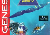
I was surprised when I found SeaQuest DSV as a Genesis title that I didn’t recognize, or remember anyone mentioning. I didn’t know what to expect. My first impressions were good, mainly that the graphics are advanced, and fairly unique in the Genesis library. This is one of the few Genesis games that heavily emphasizes pre-rendered 3D-style graphics. And while such graphics were typically used with a cartoon art style, like Sonic 3D Blast, VectorMan, and Donkey Kong Country, SeaQuest DSV instead seems to be striving for cold, hard realism!
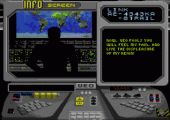
The title screen shows a watery, rippling reflection of the logo, and if players don’t press Start, there are some slightly-animated cut scenes explaining the plot. The cut scenes are shown as if on a computer screen; everything looks good, and seems to be shooting for photo-realism. Basically, the plot is that some bad guy brought a sub to an underwater base and shot missiles at it.
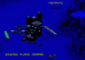
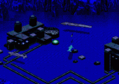
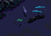
Upon hitting Start, there’s the isometric ocean-floor, with pre-rendered sprites for all the sea craft. It almost looks like real 3D graphics. Screen-shots can’t do it justice, because it’s the movements of the sprites that show off their pre-rendered models, as they smoothly, fluidly rotate through many, many frames of animation, showing the craft from all different angles. I attempted to count how many frames of animation go into turning the sub around, while tapping the D-pad lightly, to tease out each frame. It seems that a full rotation of the sub goes through sixty-four frames of animation! That means 64 different perspectives on the sub, and it can move in 64 different directions! There’s quite a convincing illusion of real 3D models, and real 3D movement; it might be the most frames of animation for the rotation of any sprites, anywhere in the entire Genesis library. The various sea craft (in the isometric world) even have 3D-style distortion, with their sides facing the camera drawn bigger than the parts facing away, which is especially noticeable whenever the craft turns.
It turns out that SeaQuest DSV is based on a TV show that I had never heard of, which aired on NBC from 1993-1996, and was intended as an ocean-themed equivalent of Star Trek: The Next Generation. Since it was a live-action show, it helps explain why the cartridge graphics are so realistic. However, in-game text explains that the gameplay does not represent real-life action. Rather, this title is always showing the interface of an advanced computer, and the gameplay is all just supposed to be a simulation on that computer. This premise is interesting because it explains why the graphics are so advanced, but not quite the live-action of the TV show. Also, this premise does the trick of technically removing all violence, because it doesn’t count if it’s all supposed to be a computer sim!
The gameplay grew on me the more I explored, and SeaQuest DSV is fun to mess around with, even before getting the hang of it. The sub can always shoot at everything, and blow everything up, from every sea craft in sight, to all those futuristic buildings on the seafloor. Each small battle is fun, just requiring the sub to maneuver around enemies’ gunfire, while aiming its own guns or missiles at them. It’s fairly basic gameplay, but the pseudo-3D makes it seem like a unique experience. The sub is stronger than the enemies around it, so there’s no worry about engaging in these shoot-outs. A total beginner can probably survive at least a few shoot-outs in a row, even before getting a grip on the controls.
And the controls should work fine, if players can get used to them. The D-pad turns the sub left and right, and regardless what direction it’s facing, the sub always moves forward by pressing Up, and moves backwards by pressing Down. Interestingly, C lets the sub move up and down vertically, down to the seafloor, or up above it (which helps the sense of three-dimensional space, and the vertical movement is sometimes needed to maneuver over rocks, but it doesn’t seem to help for avoiding enemies or gunfire). The sub also has momentum from all of its movements, so the controls are responsive, but with a definite learning curve. A and B both shoot weapons of the player’s choice, out of a few that the game starts with, and weapons can be changed on the pause screen. There’s basically the choice of a few guns and missiles, of different strengths and different amounts (with more of the weaker weapons, and less of the stronger ones). The A button starts off with missiles, while B starts with a gun that shoots out from the back of the sub. I can see what they were going for, but the backwards shot always seems awkward and impractical, at least to me. So, a good Pro Tip is to switch B to a forward-shooting gun, so you can shoot a nice double attack of missiles and bullets in front of the sub, which is more useful and fun. The pause menu is a grid of small images that look like small windows on the futuristic computer screen. One part of the pause menu offers the choice of which character to play as, for each 2D stage. The sub can release one of five different robots into each 2D stage, plus an actual dolphin(!), who was apparently the TV show’s unofficial mascot: a super-intelligent, talking dolphin.
Altogether, there are seven different modes of gameplay. There’s the smoothly-rotating sub of the isometric world, and in 2D, there’s the dolphin “Darwin,” and robots resembling a fish, a truck, an airplane, a probe, and a crab. Each choice has its own strengths and weaknesses for speed, weapons, and abilities (like being able to collect items, or not). Each of the seven gameplay modes also has its own unique controls, with none of them controlling the same. So, a big part of the gameplay experience, unfortunately, is just getting used to these seven different control schemes.
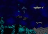
The 2D stages are interesting, for showing how the isometric stages translate into 2D, with murky water and parallax scrolling, at the bottom of the ocean. It’s vaguely similar to some of the environments in the Ecco series, but with darker colors here, and that pre-rendered style. The details of the 2D backgrounds can often got lost in their own murky, dark colors. The 2D stages also bring the most frantic action, with swarms of enemy ships swimming and shooting everywhere. Unfortunately, the dolphin and five robots are very weak compared to the enemies, so it’s frustrating. The dolphin and robots can only die once, but more can be purchased, on that same screen where they’re selected, by just clicking the button to buy more. Money comes from completing missions, like collecting boxes of toxic waste or mining for minerals. Money also comes from just destroying enemies, so there’s always money to buy more robots, as long as the player is killing enemies. If the main sub ever explodes in the isometric world, however, it’s game over. The sub only has one life. This must have been an attempt at realism, so welcome to reality; you have one life to live! However, if players then go to the password screen, it will automatically load up a password that marks all progress, so players can restart, with the same progress. So, in effect, there are infinite continues, via the password screen.
The pre-rendered sprites look great, in the 2D stages, as well as the isometric stages, for the sub, dolphin, and robots, and also for the enemies. There’s an ocean of different ships and machines to evade, chase, and shoot at, especially in the 2D stages. There are also natural sea creatures swimming around, which don’t cause harm, like fish, turtles, and whales. Even the creatures which seem harmful, still don’t cause harm, like sharks, stingrays, and electric fish. These creatures are here just because it’s the ocean, and they must not be harmed, because the game will punish the player, by decreasing the money that has been earned! The environments are mostly different shades of blue, outlined with black. It’s minimalistic, but it works. A handful of colors are used for most of the sprites, especially shades of gray/silver, brown, and white. This works well for metal machinery and sea-craft, although the living creatures also share these colors (so at first, I thought they were machines too!). Beyond that are a few bright colors thrown in for small highlights, like the computer’s yellow and green text, while the isometric view shows green lights on the seafloor. Bright yellow is also seen in some explosions, although most explosions are blue (which makes sense, underwater). Small red lights glow on top of buildings, and on the seafloor. Altogether, it works, as the dark colors fit for the bottom of the ocean, with a few bright lights shining in the darkness. The enemies are also mysterious, lacking clear identities or clear reasons for their design, and I love that, because it gives the impression of unknown alien ships and machines. For example, one enemy resembles a red truck, and it’s anyone’s guess why. Others resemble spaceships and underwater airplanes. It’s unclear if the enemies are just machines, or if they are vehicles with living creatures inside. (Of course, it’s all supposed to be a computer sim, but besides that!)
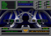
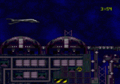
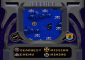
Specific missions and goals are explained with messages that the computer receives during gameplay. The bottom of the screen occasionally shows computer text, saying that there’s a message. So, the player just pauses and chooses the icon for the computer, which will have a new file of green text explaining the next goal. It’s a cool concept that the Genesis is simulating an advanced computer, even showing its physical appearance, with a pre-rendered dashboard of buttons and lights.
Unfortunately, even the most basic goals and missions generally seem impossible, because the 2D enemies are so much stronger than the player’s robots (and dolphin). For example, if the goal is to collect crates of toxic waste, a robot might only grab a few, before it explodes, from enemy gunfire. Even if two or three robots are sent into the same 2D stage, it’s unlikely to complete the goal entirely. (However, if players bring the robots or dolphin back to the starting-point, they can return to the sub, and regenerate their health, to try again. The enemies don’t seem to re-spawn in such cases.) If players lose all their robots and dolphins, and run out of money to buy more, they can always return to the isometric world and make money by destroying more enemies. This is rather easy in the isometric view, but there’s usually a slow drain of life, from the damage sustained during these shoot-outs. There seems to be no power-ups, but the sub’s health does regenerate slowly (in the isometric world) from the sub’s crew members slowly repairing it. So, there’s another element of gameplay: Players can choose to kill time to let the sub’s health bounce back. While the isometric world is fairly easy to survive a bunch of shootouts, the 2D stages are almost impossible to survive at all, and this is the fatal flaw of SeaQuest DSV. It’s nearly impossible to make any progress, and this is probably why no one remembers this title, despite its decent graphics.
The complexity of gameplay, and all its different aspects, creates a convincing world to explore, and a convincing responsibility of manning a sub with different missions and obligations to carry out. Unfortunately, the complexity also makes this title very ill-suited to just pick up and play, because it takes a long time to figure out all the details and quirks, and how to actually make progress. Although there are some similarities to the Ecco series, that series is less complicated than this, with more beautiful graphics and music, and with many more stages and environments to explore. SeaQuest seems to have about two dozen of the 2D stages, and four isometric stages, which are like a hub for the 2D stages. Each isometric stage has a different color, but most of the 2D stages look quite the same, so there’s the impression that there’s not much to see here, despite all the different stages, goals, and missions.
The audio of SeaQuest DSV is solid, though not quite as advanced as the graphics, which remain the most appealing aspect. The handful of songs sound very complicated and rich, with many different notes and different rhythms playing over each other. It’s definitely one of the more complex soundtracks on the Genesis, although the actual notes sound like classic FM-synth. The sound effects are mostly just gunfire and explosions, but they sound better than most such sounds on Genesis. And the explosions actually sound great, with deep rumblings that echo out, every time a projectile hits something. The sound effects are basically limited to those two effects, but they sound full and satisfying.
This title was also released for SNES, after the Genesis release, so of course the game can be expected to rock more colors on SNES, and it could especially make a difference for pre-rendered graphics. So, as great as the Genesis title looks, the SNES title looks brighter and more colorful. The developers also took their extra time to add more special effects to the SNES version, which is disappointing, because it gives a false sense of that console being superior for such effects, even though the Genesis is fully capable of the same effects, or comparable effects. For example, the overview graphics have a rippling effect on SNES, which the Genesis was fully capable of doing… but the Genesis only shows rippling in the 2D stages.
Along those lines, the SNES uses transition screens of that Mode-7 effect (where the screen becomes large, zoomed-in pixels). The Genesis could actually do the same thing in software (as seen in Pier Solar), but even short of that, it could easily do some other type of transition effect. (Instead, the Genesis version just switches screens, with no effects, at all). SNES also boasts a spotlight effect, with light surrounding the sub as it moves through darkness, which the Genesis could have done, but doesn’t. Those extra special effects make the SNES version a little flashier, so most folks would probably prefer that version. But I actually prefer the Genesis graphics, because I prefer the darker colors used, rather than the neon colors in the SNES version. Sure, it’s more colorful on SNES, but those bright colors seem out-of-place, at the bottom of the ocean!
While the gameplay might seem impossible, the password system lets players skip around the mining missions, although they tend to be pretty similar, requiring some items to be fetched. There are also password codes for extra life and weapons, and even debug-style options like moving through solid objects, removing most enemies, or stopping enemies from shooting, etc. For those who’d like to see their way through the title, one code brings an automatic win, for each mining mission that is visited. These cheats might actually be the most fun way to enjoy this title, although only one password can be used, at a time.
SeaQuest DSV is such a mixed bag! The graphics are some of the best pre-rendered graphics on Genesis. Plus there’s good music and sound, and solid gameplay; which is unfortunately a bit too complicated and difficult for most people to enjoy. SeaQuest DSV is worth diving into, or at least, it’s worth dipping your toes in the water, to see if you might enjoy its complicated gameplay. However, when it comes to 16-bit simulations of the sea, Ecco the Dolphin will always be the king of the ocean.
SCORE 7 out of 10

Recent Comments