Genre: FPS Developer: Core Design Publisher: Virgin Games Players: 1 Released: 1992
Some games are just way ahead of their time. They try to take the gameplay experience to a new level, be it by employing a new perspective, a different manner of controls, or by mixing different elements together. Therefore, it is hard to determine which game truly came “first” in its respective genre. If you’re asking people for the first real first-person shooter, most will most likely answer among the lines of Wolfenstein 3D. However, if you’re looking for the first game that employed a first-person POV, allowed you to shoot at enemies and played in a real-time environment, you will find that Corporation is the elder game – by two years!
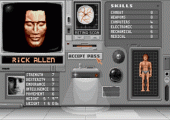
Interestingly enough, Corporation isn’t just a run-of-the-mill FPS either! Rather, it is an RPG. You can choose between one out of six characters (two male, two female and two androids) that all have different stats, determining how much they can carry, how much damage they’re dealing, the success rate in repairing electronics, hacking and such. The four human characters can employ PSI powers, while the androids have a way higher rate of strength and endurance. In that regard, Corporation isn’t quite like your standard FPS like Doom or Duke Nukem, but rather like a more fluent science fiction version of Eye of the Beholder (where you don’t just move in 90°-angles), or a very early precursor to games like Deus Ex or System Shock.
Take these comparisons with a grain of salt, however. As I said, the game was ahead of its time, and this breaks down to one major problem: technical limitations! Corporation was originally released on the Amiga home computers, and it shows. More on that later, but let’s have a closer look at this game first.
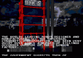
Corporation is set in a dark, far away future. Robots have replaced most humans to do work, and the biggest producer of these machines is the U.C.C. (Universal Cybernetics Corporation). After a number of strange and gruesome killings outside the London headquarters of the huge corporation, and a robot running amok in the city, the secret service called ZODIAC decides to take action. The player assumes the role of one out of six agents who are set loose on the rooftop of the UCC headquarters. The mission: infiltrate the building, pave your way down through five top levels and eight sub-basements and retrieve proof of any illegal activities performed by the UCC. To do so, you have to avoid cameras, kill enemies, gain higher access levels to computers, pick the locks on doors and so on.
The first mistake you are likely to make is to simply rush in and all-out attack whatever enemy you see. This just leads to an early game over. Corporation applies the first-person view to a RPG approach. If you run ahead and are seen by a security camera an alarm rings out, attracting all enemies nearby. So you should shoot cameras from a distance and otherwise try to preserve ammo. Your basic directive on each level is to find a computer console and raise your access level on your security card, then use said card on an elevator and venture deeper down into the corporation’s lair.
It pays to look around, though, to get better equipment. Visors allow you to recognize pockets of gas detrimental to your health or energy emissions, lock picks open closed doors, jetpacks allow you to fly. The portable computer (which displays a HUD map of the level) and the compass (shows the direction in which the computer terminal lies) are absolutely necessary if you don’t want to get lost. If you want to avoid robots and cameras altogether, most levels have a fuse box where you can simply cut the power to the entire level. Your strength determines how many items you can carry; if you’re too loaded you lose energy faster, so you should drop whatever items you don’t need. The four human characters may over time learn PSI abilities that allow them to fly without jetpacks or to heal themselves at will.
Sounds rather exciting, doesn’t it? As great as the premise might sound, however, the execution pretty much falls flat on its ass! This is mainly because of one reason: this game saw the light of day way too early, before technology was advanced enough. As such, both presentation and gameplay have suffered big time!
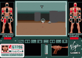
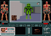
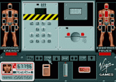
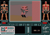
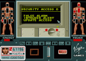
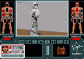
First, the graphics: While enemy sprites are actually quite detailed and beautiful, the stages themselves look absolutely horrible! The walls are just sets of gray, featureless polygons, with hardly any shading and no textures whatsoever. You can’t look very far, and wherever you go, each room looks the same. Doors are black rectangles set in the wall and come in two varieties: some with another grey rectangle at their side (locked doors where you need a code or a lock pick), and some without those (unlocked). Later levels differ marginally in their looks, mostly by giving roof and floor slightly different colors and throwing other enemies in, but that’s it. The design is just bland and boring. Just take a look at the screen shots and you see what I mean.
The same can be said for the music, by the way. The soundtrack consists of some minimalist pieces of synth music that only change on two occasions: When you’ve triggered an alarm, or when you move undetected. It took me quite a while to even realize that there were to different tracks, and even longer to realize what caused them to change.
You’d suspect that these marginal looks might improve the game flow, but sadly that’s not the case. The frame rate drops when too many enemies are on-screen. Technical limitations of the time the game was created might be responsible for these minimalistic looks (the game was originally released in 1990, though more beautiful games came out the same year). They could’ve at least added some wall textures to the Genesis port, though!
By the way, the screen layout is confusing as well. The screen is framed by two vaguely humanoid shapes. The one on the right are your pockets, so to speak. Items can be placed at your head (visor, gas mask), your hands, your hips etc. That means you can only use or carry certain items at the same place at the same time. If you use a gas mask, for example, you can’t put the visor on your head and have to carry it in your inventory or drop it. The one on your left represents your health and injuries to your vital spots. Take too much damage in the head region, and you’re dead even if your energy level is still quite filled. You can rest to replenish energy (via the “ZZZ” button in your menu), but to heal yourself you need med packs or the HEAL-PSI command.
What really does the game in, however, is the awkward control scheme. The home computer versions had mouse controls that had to be adapted for a game pad (no, this game doesn’t support the Mega Mouse). This turned out to be cumbersome, to say the least. To pick up items, for example, you can’t run over them. First, you have to walk up to one of the strange chrome domes you see strewn all over the levels. Move over one and the screen on your lower left shows what item it is. If you want to pick it up, you have to press start to access the menu, then select the “pick up” command, then leave the menu again if you want to move. You have to go through similar movements when accessing a terminal or hacking a door. Oh, and the game doesn’t pause while you do that, so don’t try picking up items while an enemy is near, or you’re toast. And finally, there’s the shooting. You automatically aim at anything that is closest to the center of your POV. While auto-aiming sounds wonderful, it’s actually horrible. An enemy just needs to move to the side, and instead of him you shoot a warning light on the roof – a waste of your very limited ammo.
Bottom line: The idea behind Corporation is pretty good. In 1990 there were hardly any games like this out there on home computers – the closest would be Eye of the Beholder, and that one didn’t really move in real-time. This FPS/RPG mix might be the only game of its kind on the Sega Genesis! I really wanted to get into the game, and once I figured out what certain items did and what actions I can actually perform, I was willing to give it another try. However, the visuals are horrible and the sound is boring, which are detrimental to actually try playing the game over a longer period of time. Add in the messed-up control scheme, and you end up with a bland game that is very awkward to play. This just isn’t fun.
SCORE: 2 out of 10


As a sidenote, the first modern style FPS was Xanth Software’s MIDI Maze (1987) for the Atari ST (and ported to various consoles as Faceball 2000).
I say “modern style” as in: proper 3D graphics and free movement. If you’re looser with the definition and accept wireframe objects in an open space, you have Atari’s Battlezone (1980) as the first; or if you accept tile-based movement (in evenly spaced steps and 90-degree turns), you have Steve Colley’s Maze War (1974) for the Imlac PDS-1.