Let’s forget about sound, music, gameplay, and presentation for a moment. Cleanse your mind of such unnecessary considerations and for a moment contemplate one thing: graphics. Only then will you be able to fully appreciate this article, for in these pages we will deal with that element only. And hey, you know you love a good-looking title, no matter what you say about ‘gameplay is what matters’. At the end of the day, it’s the games that shine forth with awesome visuals that really make us giddy about our chosen console. In this article we’re going to look at the games that truly set the G/MD ablaze with glory.
Best Use of Multi-Jointed Sprites: GUNSTAR HEROES
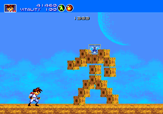 Everybody knows that smoother animations can be attained by piecing together characters with smaller sprites and then programming the pieces to move fluidly as a whole. That way you don’t get choppy animations and you can make bosses as big as you want. The only problem is slowdown; if you can get it right, though, it looks terrific. And leave it to Treasure to master the technique. You want huge, segmented bosses that move like they’re alive? Here you go, sprite connoisseurs—the Seven Force! And then there’s all the other end-of-stage opponents, too. Once you see this stuff you’ll barely be able to stomach those choppy, jerky, pint-sized ‘bosses’ that are so common in other games.
Honorable Mention: Exo-Squad, Bio-Hazard Battle.
Best Use of Color: RANGER-X
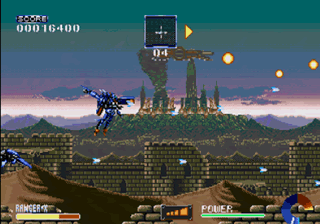 It’s often been said that Gau Entertainment used some sort of coding brilliance to allow for more than the standard 64 colors onscreen at once, and not in the infamous Highlight/Shadow mode way. That’s pretty easy to believe—you’d swear you were playing an SNES game if you saw the first boss out of context. The game isn’t psychedelically vibrant like Dynamite Headdy, but there’s still a ton of color and Gau used it to display some extreme detail. Hence the qualifier ‘use of’. Sure, there are games that are brighter, but nothing can touch Ranger-X when it comes to classy, professional use of that color. Mechs have never looked so good on the Genesis!
Honorable Mention: Sonic the Hedgehog 3, Sonic and Knuckles.
Best Use of Lighting: VECTORMAN
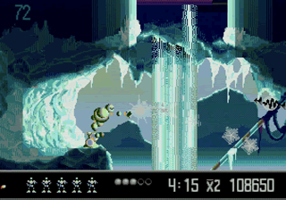 The original VectorMan looked almost like a tech demo, and that’s a good thing. Each level had some sort of graphical trick that burned it indelibly into your mind. Some had to do with the vector graphics, some had to do with parallax. But the ‘trick’ that was present throughout the entire game was lighting. Many games (Earthworm Jim comes to mind) had some sort of lighting effect drawn onto the character sprite when you fired a gun, etcétera, but nothing had the sheer dynamics of VectorMan. Sure, there’s the muzzle flash light-up effect, and it’s a beauty to watch, but there’s also that incredible silhouette mode that’s masterfully put to use in some of the later levels. It’s so…smooth! That silky transition from normal shadows and to stark backlight and back again was one of the coolest things in the entire game. VectorMan 2 tried to be just as cool with the lava and the squirt bugs, but it can’t beat the genius of the original design.
Honorable Mention: VectorMan 2, Earthworm Jim.
Best Use of Pre-Rendered Art: SONIC 3D BLAST
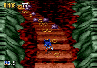 Who can ever forget that dazzling opening video? Sure, it’s grainy, but when was the last time you saw a full-screen, full-color CG movie running that fast on your Genesis? I don’t know how Traveler’s Tales managed to do it, but the intro looks fantastic and has earned a special place in this gamer’s heart. What a way to kick off a Sonic adventure! And once you get through the pleasing title screen and snazzy rotating menu, there’s the in-game graphics to consider as well. All of the objects and backgrounds are crystal clear and pleasing to the eye, with not a hint of slowdown to be found. The animations for the Flickies, Badniks, and Sonic are fluid, too, so there’s really nothing to complain about with 3D Blast…graphically. If only this game was as fun to play as it looks! This is one of those titles that will bug you for a long time—why couldn’t they have gotten the gameplay up to the same caliber as the graphics? If they had, then Sonic 3D Blast would probably have been the greatest Sonic entry on the Genesis. As it is, it’s a gorgeous looker, but with no substance.
Honorable Mention: Toy Story, Rise of the Robots.
Best Use of Scaling: PANORAMA COTTON
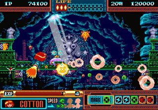 You heard a lot about scaling in the old days. It was like a magical treasure that the arcades had and the home consoles wanted. So despite the fact that the Genesis hardware did not support scaling (or rotation, another crowdpleaser) right of the shelf, most games had some sort of software-based scaling routine. As you might guess, some were better than others. The best example of scaling done right is Panorama Cotton. Forget Afterburner II or Space Harrier, in which objects were tiny splotches one second and looming in your face the next. Here there’s nothing but liquid size changes that are so good you can barely see the stages progress. In fact, everything is so well done that you really get the feeling of true 3D. In many games of the era that use scaling, the game objects in question don’t really seem to ‘be there’, if you know what I mean. They don’t seem solid. In Panorama Cotton, there’s no sense of floaty non-reality. It’s jaw-dropping, to be honest, and I simply cannot understand why they didn’t make more copies of this title.
Honorable Mention: Street Racer, Road Rash II.
Best Use of Polygons: VIRTUA RACING
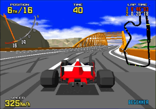 Polygons were all the rage in the early nineties, mostly on the home computers of the time. They were horridly ugly until Virtua Fighter hit the arcades, but the tech-hungry masses ate it all up like so much chocolate cake. Some of those games made it from the personal computer world to the Genesis, although most had to do some major technical contortions in order to run on our favorite 16-bit system. For instance, Electronic Arts games like LHX Attack Chopper and F-22 Flight Interceptor use both the Z80 sound processor and the Motorola 68000 processor simultaneously in order to share the load—no small feat considering the radical difference between the two chips. There was also trick involving the use of a 13.4 MHz clock speed that was built into the Genesis cartridge port. Put it all together and you have some impressive, if choppy, polygonal moments.
In 1994, however, Sega went and packed an all-new chipset into the home version of their arcade smash hit Virtua Racing in order to support better polygonal graphics. Now, some of you might object to Virtua Racing‘s placing as ‘best polygonal graphics’ because of what I just said—the cart uses more chips. Nevertheless, it does indeed operate on a stock Genesis without external assistance (like a 32X or Sega CD, so for the purposes of this article it’s a Genesis game. And what a game it is! I don’t care if it isn’t arcade-perfect, the bottom line is that this is a stunning achievement on a system with such limitations. I’ve used the term ‘smooth’ many times in this article, but here it is again: the graphics are smooth. Yes, yes, there are some distortions of the various onscreen objects, but can you really complain? It was the mid-nineties, and no matter which way you cut it, Virtua Racing is a far cry from OutRun.
Honorable Mention: Out of This World, F-15 Strike Eagle.
Best Use of Parallax: LIGHTENING FORCE
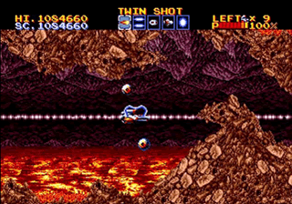 There were two things the Genesis did well. First, displaying tons of sprites. Second, displaying loads of parallax—layers of sprites moving at different speeds in order to give the illusion of depth. And it’s obvious to anyone who sees the clouds in the first level of Lightening Force that Technosoft had mastered parallax on the Genesis. When I first snatched this game up complete at a garage sale for a measly $1 and booted it up, I was floored. Lo and behold: line upon line of razor-sharp clouds that are almost as mind-boggling as those Magic Eye books from the same era. And it doesn’t stop there. The use of parallax continues throughout the game, although admittedly in smaller quantities. It’s too bad that such a nifty special effect like parallax was lost to the world with the onset of polygons. Because back in the day, it was oh-so-cool.
Honorable Mention: Eliminate Down, Gleylancer.
Best Use of Special Effects: THE ADVENTURES OF BATMAN AND ROBIN
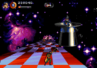 Who the heck Clockwork Tortoise is, I don’t really know. (Although my guess is that it must be an internal development team at Konami.) Why they didn’t make more games for the Genesis, I can’t answer. How they managed to fit the graphical motherlode that is The Adventures of Batman and Robin into a Genesis cart, I could even begin to speculate. Bottom line is that they did it, and no matter what you think of the gameplay or music, the graphics flat out rock and are my personal choice for *best graphics on the Genesis system.* Lots of games have awesome special effects, but none have them in the insane quantity that Batman and Robin does. Check out that first level! How often have you seen parallax used to such and astounding 3D effect in a side-scroller? And the explosions, for that matter. KA-BOOM! The vector graphics for the claw boss; the awesome forward-scrolling roller coaster for the Mad Hatter. The epilepsy inducing colors for that giant puppet boss. The constantly-moving Cheshire Cat. The layer upon layer of clouds in the flight stages. All of this adds up to one wild ride that will leave you with new respect for the Genesis Power and a feeling of empty regret…why couldn’t more games have been this incredible graphically?
Honorable Mention: Contra Hard Corps, Alien Soldier.

Recent Comments